When it comes to web design, different industries demand different approaches.
A tech company might need bold headlines, compelling copy, and interactive elements to explain their services. An e-commerce store requires an optimized flow to push visitors toward purchases.
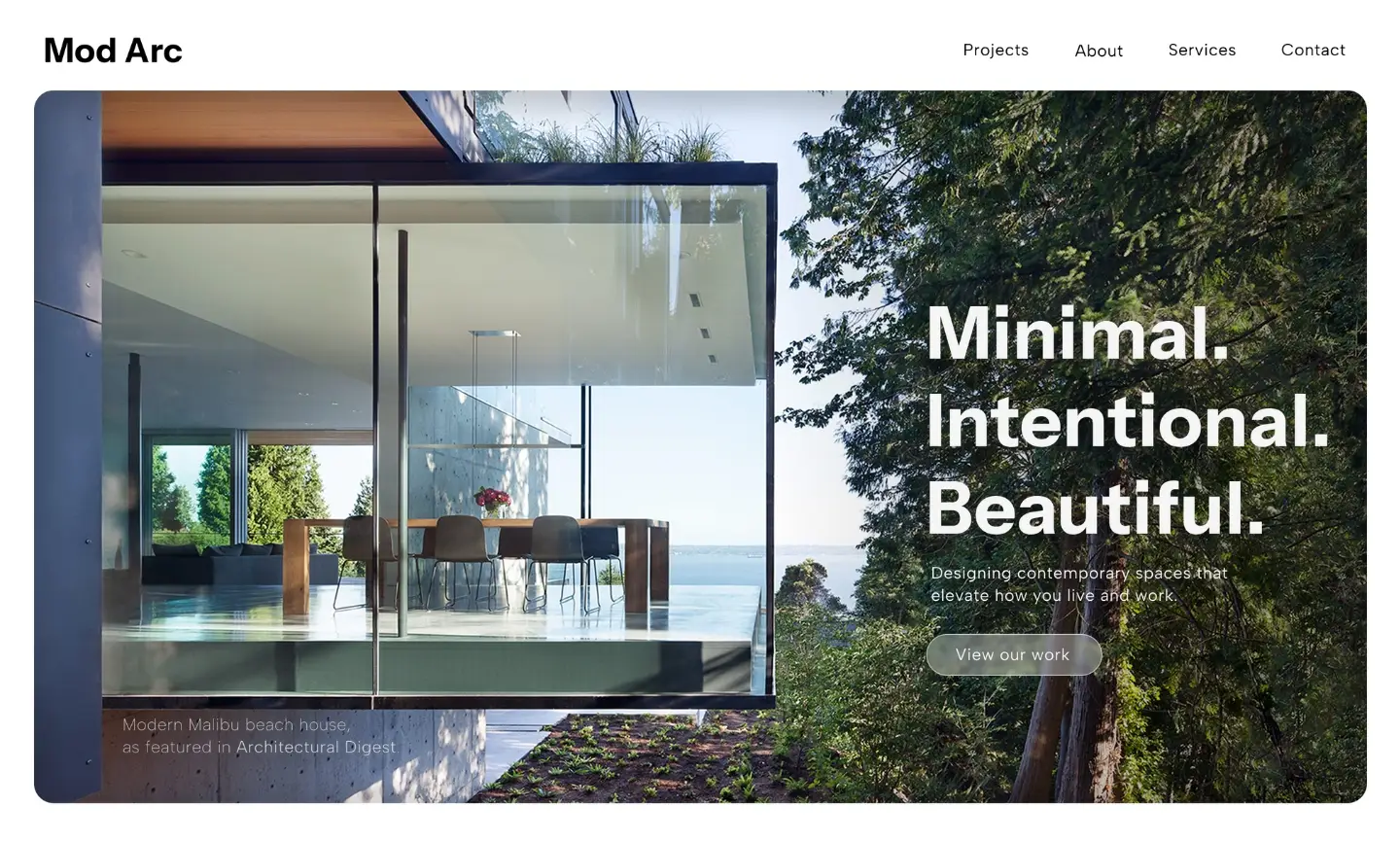
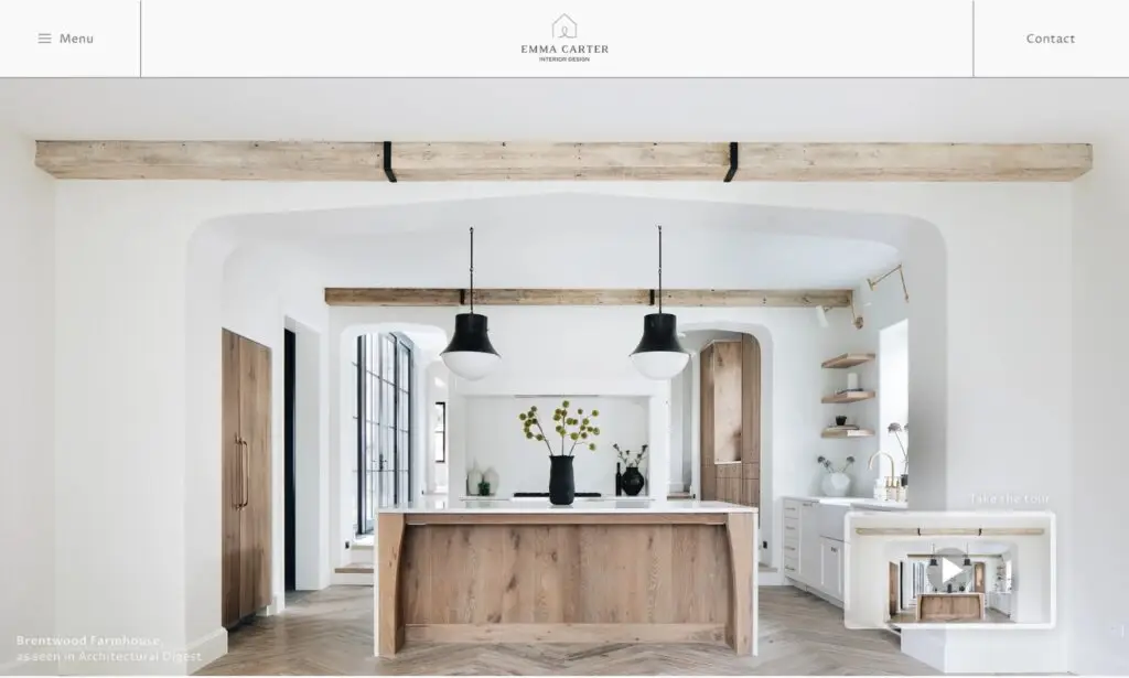
But for architects and interior designers, the website itself should act as an extension of their work—minimal, refined, and visually striking.
Unlike service-based businesses that rely on heavy messaging and persuasion, architecture and interior design firms benefit from letting their work speak for itself. Often, a single image can communicate expertise, aesthetic sensibility, and quality far better than words ever could.
Minimalist web design perfectly aligns with this approach, allowing imagery to take center stage while eliminating distractions that could dilute the impact. Let’s explore why minimalist design isn’t just an aesthetic choice for architect and interior design websites – it’s a strategic one.
1. Less Clutter, More Impact
The power of minimalism lies in its ability to strip away excess and allow what matters most to shine. For architects and interior designers, what matters most is their work. Overly busy layouts, large amounts of text, and unnecessary graphical elements can pull attention away from the imagery and weaken the overall impact.
A minimalist website design ensures that every element serves a purpose. By using generous white space, simple typography, and a clean layout, the focus remains on the portfolio itself. This creates a sense of sophistication and allows visitors to fully absorb the quality of the work being presented.
Real-World Example: The Power of White Space
Imagine landing on an architect’s website where the homepage is filled with a large block of text explaining their philosophy, a video playing in the background, and multiple call-to-action buttons competing for attention. Compare that to a homepage featuring a full-screen image of one of their most stunning projects, with nothing but a small logo in the corner and a subtle menu.
Which one feels more high-end? Which one creates an immediate emotional response?
Minimalism helps create an effortless user experience while elevating the perceived value of the work.
2. Images Speak Louder Than Words
In industries like tech or finance, where the product or service isn’t always visually compelling, strong copywriting is essential to communicate value. But architecture and interior design are different. These industries thrive on aesthetics, and nothing conveys quality, creativity, and precision better than striking imagery.
Because of this, many high-end architecture websites don’t even require a headline. A stunning image alone can evoke curiosity, emotion, and interest—often more effectively than a block of text.
Let the Portfolio Do the Talking
Visitors to an architect’s website aren’t looking for persuasive sales copy; they’re looking for visual proof of excellence. A carefully curated set of images, showcased in a seamless and elegant way, is often all that’s needed to captivate potential clients.
By using large, high-resolution images with minimal interference (such as excessive navigation bars, text overlays, or decorative elements), the site becomes an extension of the designer’s work—sleek, intentional, and well-balanced.
3. The Psychology of Minimalism: Trust and Perception
Minimalist design isn’t just about aesthetics—it also plays a crucial role in how visitors perceive a brand. Studies show that people associate simplicity with luxury, competence, and confidence.
Luxury Brands Embrace Minimalism
Think about luxury fashion brands like Chanel or high-end watch companies like Rolex. Their websites and branding aren’t overloaded with information or clutter. Instead, they rely on large visuals, generous spacing, and minimal text to create a feeling of exclusivity and sophistication.
The same principle applies to architect and interior design websites. A clean, well-structured layout gives the impression that the firm is confident in its abilities—there’s no need for over-explanation or aggressive sales tactics. This builds trust with potential clients, making them more likely to reach out.
4. Minimalist Design Enhances UX (User Experience)
A well-designed minimalist website doesn’t just look great—it also provides a frictionless user experience. Architecture clients aren’t looking for a complicated browsing journey; they want to see the work, get a sense of the firm’s aesthetic, and easily find contact information.
Navigation Should Be Simple
Minimalist websites often feature a simple, intuitive navigation structure. This could mean a hidden menu that appears only when needed, or a single-page scrolling experience where users naturally flow through different sections.
By reducing the cognitive load, visitors can focus entirely on the work rather than figuring out how to navigate the site. This seamless experience reinforces the idea that the firm values clarity, efficiency, and high design standards.
5. Mobile Optimization and Performance Benefits
Minimalist websites aren’t just visually appealing—they’re also practical. Since they avoid unnecessary elements, they tend to be faster, more responsive, and easier to optimize for mobile devices.
Speed Matters
Studies show that 53% of mobile users abandon a website if it takes longer than three seconds to load. Because minimalist sites avoid excessive animations, heavy scripts, and bloated design elements, they typically load much faster, ensuring that potential clients don’t leave out of frustration.
Adaptive Design for Different Devices
With mobile traffic making up a significant portion of website visits, it’s essential that architect and interior design websites look just as stunning on a phone or tablet as they do on a large desktop screen. Minimalist design naturally lends itself to mobile responsiveness since it prioritizes simplicity and scalability.
6. Timelessness and Longevity
Trendy web designs can quickly become outdated, requiring frequent redesigns to stay relevant. Minimalism, on the other hand, is timeless. It doesn’t rely on gimmicks or fleeting trends—instead, it focuses on fundamentals that will always be effective: clean layouts, high-quality images, and seamless user experience.
For architecture and interior design firms, this means a minimalist website will continue to look modern and sophisticated for years to come, reducing the need for constant updates or rebrands.
Final Thoughts: A Website That Reflects the Work
An architect’s website should feel like an extension of their design philosophy—structured, intentional, and elegant. Minimalist design allows their work to take center stage, eliminating distractions and creating a seamless, immersive experience for visitors.
By embracing minimalism, architecture and interior design firms can:
✔️ Let their portfolio do the talking
✔️ Enhance credibility and trust through clean design
✔️ Provide a seamless user experience that feels effortless
✔️ Ensure fast-loading pages and mobile optimization
✔️ Create a timeless online presence that doesn’t need frequent updates
At CHVRLESKELLY, I specialize in crafting high-end, minimalist websites for architects and interior designers who want their work to be the focal point.
If your website isn’t reflecting the level of quality you provide, let’s create something truly exceptional together.